2010年10月31日星期日

Object of Industrial

    “Today you find only a few companies take design seriously, it is Apple.” Dieter Rams said in Objectified film.
    Apple Inc. is an electronic and software company, but it is also a good design products manufactory. Every time Apple had something new to come out, it can always beyond all expectations. Apple did very successful on design, because they never need commercial to express the news of their new product. People will come to it and buy it.
    iPhone is a model of success design product. I remembered when new iPhone 4 just offered for sale, people need to pre-order to get it or wait until they can buy it at Apple store. Every generation of iPhone have a huge change of software from the previous one, but a bit difference of the form design. It is easy for people to recognize that is iPhone not others, and easy start with. But why people can identify this is Apple product when the first time they look at it? That will be the unique attribute of it. For example, the material is made from, and the form that connects to the material.
iPhone, when people connect with it, it is only the giant display screen and a small button on the bottom on the front surface. That makes it very easy to use. There are only two things you can touch, the button or the screen. So when we use it, we did not think that has been designed. Because the form is so simple and clear, and then it feels almost undersigned. Or like the phone should be like the way, it would not be any other way.
    Actually to produce an iPhone have to go through many multiple operations. It is amazing when you see the original piece of a part of the design process to the final shape. When the iPhone get into our hands, it is very smooth and we will not look at the back or figure out why the silent key is on the side. Because this is already removed the not important part from our attention.
Design’s mean idea is to not think it is designed but think that is what it was.

Form & Content: Objectified

    The great design should affect us in our daily life, and great designers should think about how to make every little change to improve people’s daily life even people don’t really notice them.
   Content is implies subject matter, what is means of this design. When people see a new object, they tend to make many assumptions about it. What it does? What is the surface feels like? Or how can I use it? Every object has a story behind it. For example, Andrew Blauvelt said in the film about the Japanese style toothpick. I noticed the end of the toothpick has two or three loops around it, but I did not know what it is for. When I use this kind of toothpick I always hold the end and feel it, I thought it was just for aesthetic of the design. Until I watched this film, I understand that we can break this part and signified that is used. It is quite simple but it is also very amazing to know the real meaning of this design. 
     Form as a design term, it is purely visual aspect, total visual aspect of work, like what the color should be on it, what the shape should be, or texture. When designer designs objects, they always think about the form first. What do the people want to see in the future? Also the form is not only for what is will be look like, but also it is a way to users to understand how to use it. Like a bottle of spray beside me. There is texture and an arrowhead on the sprayer, that arrowhead is both hepatic and optic to help the users to find the sprayer direction.
   After I watched this film, I looked things around me, they are all designed objects. Maybe those things are not valuable, but they are all meaningful to me. Like this tiny toy bear laid on my book shelf; it is old, dusty, and no one will notice it. But I carried this thing with me almost ten years. When I feel depress or upset, I will have it in my hand and talk to it. I really like the design of this toy; it is soft and easy to hold in my hand. Its value to me is already beyond the real value of itself.

2010年10月18日星期一

Design as a Conversation

Now, the internet is the main way to have conversation with other people. YouTube is the biggest website to post your own DIY video on it, so other people can watch it and leave comments on it. Michelle Phan did very successfully on her DIY make-up tutorial; her video gets very popular now, over 20,000,000 video views on YouTube. In 2010, she was hired by Lancome as a online make-up video producer.She has her own style to make make-up video that incorporates her voice of whole instruction with music and subtitles that help audience to read and know what she is using. Also sometime, people ask her some question, she will response them or even make a video to answer the questions. So she has conversation with the audience and support the knowledge of make-up to her audience. Some audience made video on YouTube just for thanks for her, because they improve their skills on make-up from Michelle Phan’s video.It is very easy to get the concept of her tutorial while watch her video. In the video she usually does not speak out to interrupt her steps, but incorporate her voice to make clear why she did those steps. Even some people do not know how to start make-up, she has the basic level such as how to draw eyebrow, how to put foundation on your face, etc. Then her audience can be in different levels.Her most popular videos are “Romantic Valentine Look”, “Seductive Vampire”, and “Lady Gaga”, if you are interested you can search it on YouTube.In this video, Michelle did a make-up for Halloween custom.And Happy Halloween.

Comparison and Contrast

Those days I was watching some interesting photos that were shoot under the water. I found two very talented and hard working photographer. Their photos are breathtaking beauty. The first one I want to introduce is Zena Hollowa. When people talk about underwater shoot, her photos cannot be ignored. She was born in 1973 and has been working as underwater photographer in London since 1995. The second photographer is Elena Kalis, she is Russian-born photographer, and she just started shoot photos only a few years ago, but she has the ability to be famous in a short time period. In my writting, I will compare and contrast this two amazing underwater photographer's work.
       Zena Hollowa’s 2006 photo album is named “Swan Song”, telling us an fairy tale story in her water world. In her photo, female model are more mature looking. But in this photo she chose a young girl, she is like an angel in her underwater world.(actually, it should look like a swan) Model’s cloth is made of silk probably, and the cloth’s edges are more look like feathers, especially in the water. The white cloth against the black negative space, then we can easily focus on the girl when we justice her photo. The light is from top of head and it’s creating a peace, coziness surroundings as heaven. The line of cloth waved, light, floated in the water wave. In this agravic world, her hair and the white silk cloth are toward to up, in her video of this, the girl moving and waving in the water just looks like a swan swing in the awter. I felt it makes the photo unreality and imagination. The right side(not in this photo, but you can find it in her website) is like some smoky thing in the water and the shape just like the girl in the water. She wants to emphasize this is a fairy tale, is not a real world.
       Here is the Elena Kalis’s photo who always uses her own daughter to be her model. This series photo is also a fairy tale story, Alice In Waterland, at this time her daughter modeled for Alice. In the result, as you can see, it is an attractive, colorful, surrealist world. Unlike Zena Hollowa, Elena’s style is more children’s eyes, and puerility. The color use is bright and colorful that reminds our childhood. I think she actually have more fun to play with her daughter under water than shoot her beautiful photos. Her daughter wears character cloth, so we can recognize that girl is Alice, and also the blond curly long hair. In this photo, her daughter and the camera both up side down, then show us Alice is crouched her knees and floating in the water. This position is also a new born child nature position. The photo represents every alive things come from water. Alice In Waterland describes us a mystery, glorious, and fantasy world.

       I like both of photos, in a limited space underwater can gives designer more creation and thoughts. Both photographer has rich imagination but in different ways.

SF day-trip

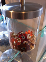
        This weekend, I went to SF with my friends. Because one of my friends wants to buy a pair of shoes, so we decide to follow him walk on the downtown San Francisco. There are dozens stories besides the streets. The first store I went to is for women cloth, but I found something catches my eyes. Many glass jars placed on a shelf in the center of the room. The girl’s accessories put inside of the jar in order. That reminds me the Cornell’s Pharmacy. He put each different thing in a little bottle, and collects 20 of them, composition and organized in one design piece. But in this store is also easy for buyers to pick up the accessory.

        After visiting the first store, we crossed a street and went into another one. This is Kozik toys store. There are full of smokin labbit and gloomy bear. It is so fun just watches those toys. Each one is painted by colorful colors. Actually the MUNNYWORLD characters are more popular, because that is just a shape of the toy, all white color, so people can design it by them self. The characters are cute but also scary-looking. For example, the dunny toys are very cute rabbit shape, but some of dunny got tortured. And also the gloomy bear’s mouth always has blood on it. some of the toy are finger size, but some of can be sited on. There are not just hard plastic toys, also has something that can be useful, like headphone, speaker, pillow, etc.   

        I never expect this trip can be visit some design work, but actually design is always around us and in our life.

2010年10月11日星期一

2011 D&G runway show

The Milano fashion week for summer 2011 has been all about fresh. The D&G Summer 2011 women’s collection is Garden Party. It is one day in the garden. Flowers are everywhere, D&G rolled out their second line for younger customers. Up to the stage are full of flower bedecked, and down to the catwalk lined with Roses, hydrangeas, freesias, violets and etc.
The theme for Ermanno Scervino(the designer) is “Modern elegance”. Boyish Men’s shirts with the Disney’s cartoon painting on it, while defined the woman of the future.
Most of the models wear sunglasses and red-chequered kerchiefs evoked summer picnics.
Meanwhile overalls worn without bras or shirts had a naughty air, as did a pair of red leather hot pants. That pants is very bright color and made my seeing followed. Lots of legs were display under short shorts or miniskirts. But some are long pants with flowery patterns on it. The high-heeled shoes are with tinge yellow or pink, and also decorated some flowers on their ankles. That makes the girls walking very powerful.
I very loved the dress in this show. Mixing flowery prints with vichy patterns, which is also very popular in Asian women’s dress style. The flower printed, poplin summer dresses take centre stage. In fact, D&G’s liner notes state that the show “ends with a party al fresco where it is imperative to show up in long floral chiffon gowns.” They are great prints and great colors. A plenty of stuff I like from the fashion show. They made the collection is inspirited by flowers.


Creativity from without

    When Prof. Housefield told us to write about something about this title, I really get confused what is this. Then, he showed us some slides and video, which is Lisa Hock got inspired from plastic cups and Pollock got ideas from his own painting etc. I suddenly get the idea what I will write about.
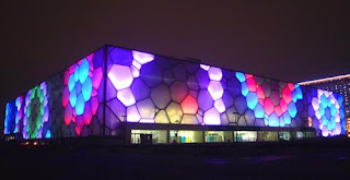
    The 2008 Summer Olympic Games took place in Beijing, China. It is very meaningful for all Chinese people, because this is the first time to hold the Summer Olympic Games in China. And the architects are PTW Architects from Australian, CSCEC, CCDI from China, and Arup International Group. Because this stadium is for aquatics, so that, they got the inspiration from water, H2O. Also, they want this one looks like a water cube. When the Beijing National Aquatics Center finished, it looks very simple, a cube. But it uses many people’s effort to build it. The square shape is more symbolic to Chinese culture and has relationship with the bird’s nest which is a nest shape. (The other national stadium for Olympic Games) Additional, it is also references Chinese symbolic architecture today.
    The frame at outside, it is the largest ETFE clad structure in the world. That can have more light at night and save the energy from the heat penetration through daylight. During the night, the light of water cube is waving on the outer wall, and has different colors. It is based on Weaire-Phelan structure, designed from the natural formation of bubbles in soap lather.
    This is a great architecture in China, maybe one day you will visit there.


Stone Soup

Last Tuesday morning, we brought something from home, like paper, cardboard, string, colors, etc. in our Design 1 class, and we made our own “stone soup” before end of the class.  Stone soup is not only the old tale in a child book; it is also about share ideas and creative thinking from other people. Each person has one or two ideas, but if there is a group of people, the number of ideas will be multiplied by the number of people in this group. Then it is the time to design something new and interesting. In our group, we have 8 numbers and plus our mentor will be 9 people. The first thing is put out our materials for the stone soup activities. So, we got many papers, types, color pens… and a T-shirt, and also a clothes hanger! Because of that, our first idea pops out. We will make a little guy named Emo(I don’t know how to spell the name currently) Then, we divide in 3 groups, one is for build his head& hair, one is for body& arms, and last one is for his legs. Finally, when we finished each part of him, we put it together. We really like what we did together and his out-looking. After we finished, some girls put tattoos on his arm and also his mouth& eyebrows, which give his some attitude for his personality.
This activity can enrich our creativity, and to show our cooperation in a group work. In addition, we are kind of a shy group, but we getting know each other more in this time, which is great!


2010年10月3日星期日

My favorite photographer


from http://jolie1118.spaces.live.com/
                                                              Today I want to talk about a girl, a young, talent, and also a beautiful girl, her name is Jolie. She is professional photographer, and she published her first book in China recently. It is about how to set up camera and shoot good quality photos and some other stuff like that. I didn’t read her book, but when I opened her blog; there is tens of pictures that she traveled or self-timer photo. Then I sat in front of my computer for almost 2 hours to see her photos, read her words. Jolie really did great work on those photos. I can feel I am into those places that some of travel photos 
from http://www.moko.cc/jolie/

    Actually she had traveled to China, Japan, Spain, England, France, Greek, and so on. We also can join in her journey because her photos are so vividly tell us many stories and experience that she has. Now, she is getting famous in the world from internet.
    Almost all of her photos are herself. She seems very quiet in her photos with different positions and angles. I also like the description under each photo, like where the place is, what her mood is, and how the weather is. (Sorry this is in Chinese) All the type of information we can get in her photo.
    Especially, I love the photo she shot in Chongqing, China. She was disface to the camera and her hand was reach to the wall in front of her. On the middle of the wall is a Chinese character”” means Buddha. The wall is solid red color with cloud carving on it, that makes her stands out.
She wrote one sentence under the photo is: close your eyes and feel the Buddha in your heart.

this picture is from Jolie's blog http://jolie1118.spaces.live.com/


Davis is a bicycle city

    My first vision of Davis is a bicycle city. And on my orientation day, the stuff of SISS informed Davis is the No.1 bicycle city in US, because the number of bicycle is more than the population of this place. That makes different from the rest of other cities. I don’t know how many bikes in this city, but I can see their bikes are all original. Someday I walk in school and count how many bikes parked beside the road. There are lots of kinds of bicycles, some wheels are big and narrow, and some are small, thick, and colored, and different shape and paint colors. Those bikes are all designed by sellers or buyers to make each one are unique, and special. Bicycle in Davis is not just a transformation tool; it is also something to show the student’s personalization. In addition, I saw the bicycle sign everywhere in downtown, on the trashcans, the guideposts… bicycle can represent of Davis, also the city of Davis create the town of bicycle. So, bicycle is a kind of signature for Davis.
    Maybe many years after, when I think about my university life, I can remember students riding bike in school to catch for the next class, ride bike with friend after school. I felt here is very quiet and peaceful, but here is not an old town, I guess people just do not like to drive car too much at here. I used to ride bike in my country, and I want to ride bike again at here.

First memories of design

    What inspired me to study in design major? I thought a while, maybe this inspiration is from my childhood. When I was little, around 7 or 8, I lived with my grandma. And my youngest aunt takes care of my grandma in the house. Whenever she has free time, she would like to sketch on a paper. Usually she sketches people’s face or objects. I would stand behind her and watched her drawing when she was doing that. I don’t know anything about drawing at that time, but only words appear in my mind is “Wow! That is really amazing, I wish I can do that.” Now I have more deep thinking is people can able to image what they saw or imagination and to share with other people.
    When I am in the middle school, I started collecting books that I like. In those books, not only readings I like, and also the illustrations. Those drawings are very connected with those stories. So when I read an article, I can actually see those characters, and some illustrations are very meaningful, because the drawing can brings more elements that I didn’t think about in the article when I reading it. Like what color for the hair, what kind of cloth that they wear in the summer, such and such… all that can lead me into the story’s atmosphere, then it helps me to receive more information from each story.
    Nowadays, we can use lots of program to draw or create beautiful digital works. It is also a fun thing to do for me. So I would like to share my thought with other people.
Great illustrations in this book.